Context Improvement in System Dashboard Design
With a strong layout and helpful visualizations our next goal is to orient the user with as much context as possible. Failing to provide any context is one of the most common mistakes in creating dashboards (Few 38)1. The context our user needs often comes from other sources not included in our carefully considered charts.
This post is part of A Practitioner's Guide to System Dashboard Design.
Basics: Text
Humans are pretty good at reading. Those that make the dashboards often lean toward terseness. In part 2 we covered Scale and Units. Labeling our data and considering the form of that label can yield comprehension improvements.
But let’s not get too deep here: just label your damn charts better. There’s no charge for letters! Imagine you’re a new operator who’s just been paged for the first time. What do you need to know?
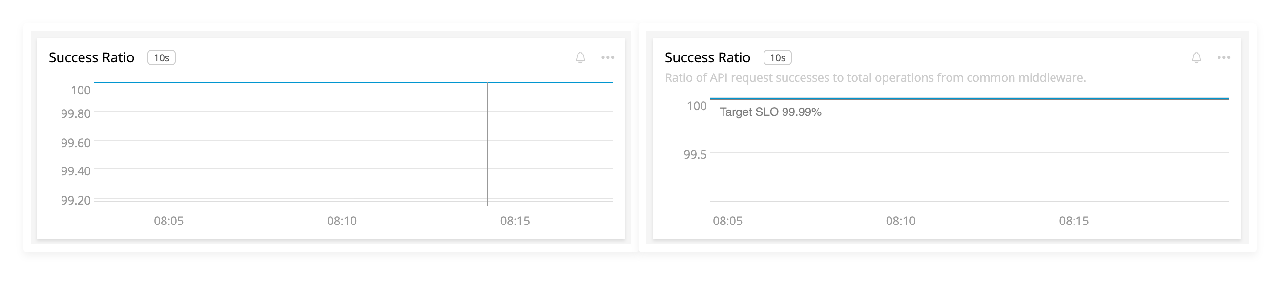
The left chart has no effort. The right side has reasonable labels to help the user understand the context of the visualization.
Basics: Next Steps
If a user wants to know more about this visualization, how can they get there? A common pattern is clicking on the title to open a fullscreen version that may allow further slicing and dicing. This a convenient place to put data tables or other helpful information:
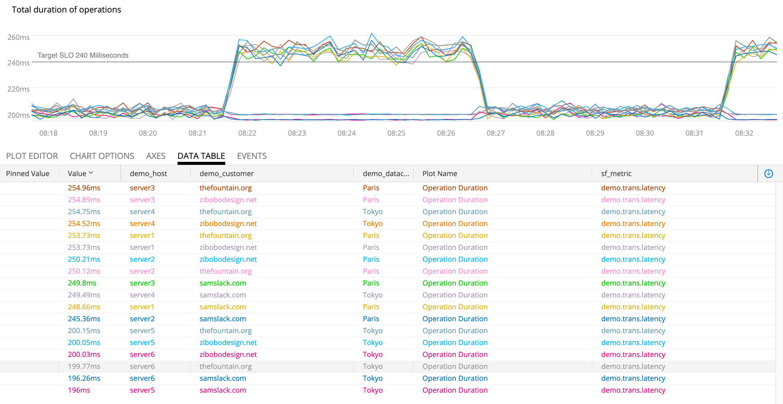
Opening the chart in full screen gives us new tools since the user has demonstrated an interest in further digging.
Seeing a bad thing in a chart might lead to another tool or to notifying teammates. Why not embed these into a menu on the chart?
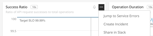
A menu could take you to an exception catcher, Slack sharing, or beginning the incident process.
Human Actions, Control Data
In part 3, Line Charts we discussed the value of time as our X axis in run charts. This is extremely helpful for readers in that it shows change over time, but the passage of time isn’t the causal factor in our data. For that we need more context.

Lots of thing can cause change. Pesky ghosts!
Tufte suggests improvement by “smuggling additional variables into the graphic design” (38) to increase the causal explanations for the reader.2 This intersects neatly with system dashboards because changes from humans or automated systems are often the progenitors of system effects. Capturing these events and visualizing them provides our user with crucial insights into what’s being done that may correlate with system behavior.
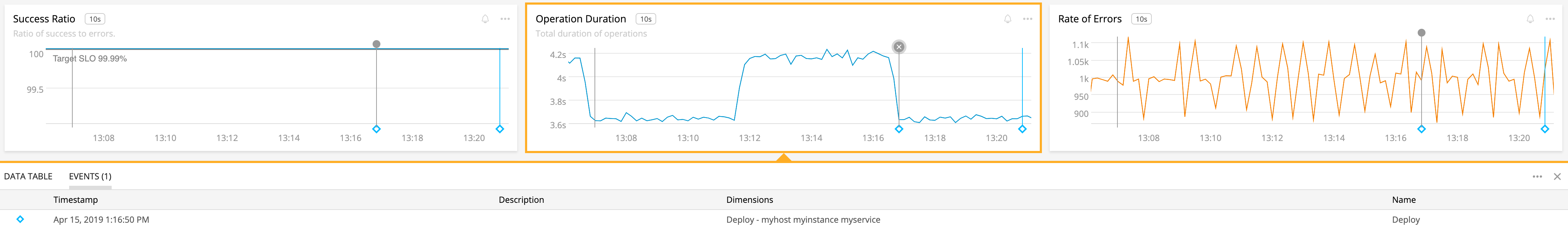
The blue diamond shows that my deploy correlates strongly with a decrease in latency. Yay!
This control plane data is much lower rate than the signals we measure in our systems. Ensuring that such changes are instrumented and available in the same place as your dashboards should be a high priority. It can significantly improve how quickly our users can accomplish their goals.
Instrumentation: Here Be Dragons
Unfortunately most tools for system dashboards have spotty support for this data, often called “annotations”. The events tend to be hard to reuse, untyped, and often assumed instantaneous. Some packages support events with a start and end timestamp for deploys and other “stepped” changes.
Furthermore, getting annotations to your dashboards is spotty and often requires hand instrumenting dozens of disparate systems. Then you must find a way to connect the relevant events into dashboards. Eek!
Some advice on how to implement this well:
- Leverage common outputs like CloudTrail Events and CI/CD systems.
- Try and reuse events rather than having users mint their own that only work in their dashboards.
- Be careful of clutter, too many events is as bad as none!
- Provide a link in the event for your user to follow to find more information. This provides the user context but avoids turning your dashboarding tool into an administrative interface. Less is more if they can click on it.
Norms, Goals, and Agreements
Some KPIs have acceptable ranges, internal goals, or even contractual obligations. Including this information in the relevant charts can be a part of the visualization (see Gauges, Bullets, Ranges, etc in Part 3) or included as context within the widget. This context helps the user avoid the requirement of what the chart “should” look like, or what impact the current value may have on stakeholders.
Many tools support this type of watermarking. Adding them provides additional context to the reader so that the time series isn’t just an arbitrary value, but a comparison to our expectations.
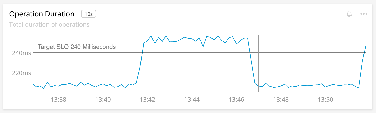
The SLO for our service is included as a watermark in the chart.
We can extend this further with time shifts, moving averages, or forms of anomaly detection to draw in expected values:
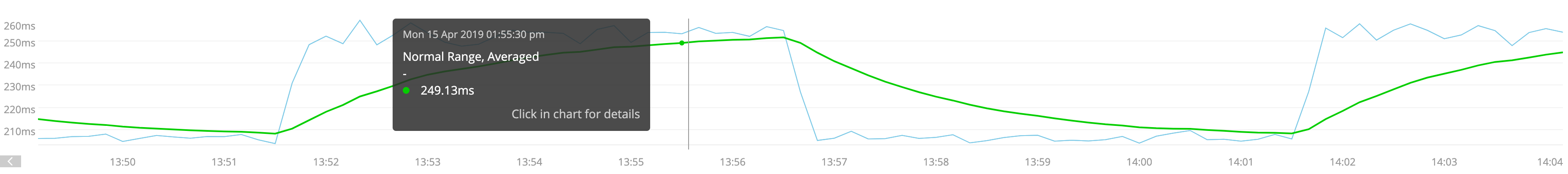
Here’s what normal looks like. This cyclical pattern seems ok!
Since we know these limits and expectations we can go a step further and process the information for our user ahead of time. Where a norm or expectation is violated, we can preemptive highlighting the violation. Now the user is drawn to the most important information (Few, 54)1.
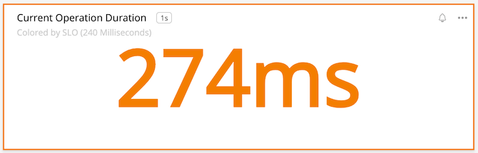
We seem to be violating the SLO on this instant chart!
We’ve gone from an anonymous line on a chart to a situation with lots of context and clear guidance as to the state of the system. Our SLO is being violated!
Flagging Alerts or Other Bad State
A common use of system dashboards is to diagnose failure, especially in response to alerting. Our earlier control-rate context can be combined with data from the alerts. When and how did this fire?
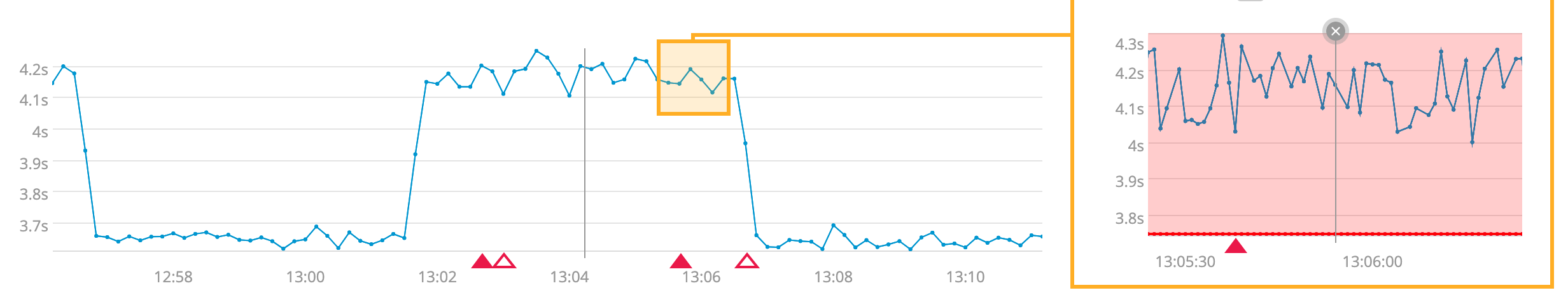
Timeline annotations for alerts, highlighted violations, and coloration of values over a threshold!
This information helps our responder understand what brought about the alert, helping them orient to the problem. Other charts may provide additional context or perhaps our added menus help with next steps.
Projections or Other Synthetic Data
Much of the data we present is direct measurement from our systems. Because of this, you should take special care when presenting data that is projected, predicted, or otherwise synthesized so that the user understands where to place their trust. The Consumer Financial Protection Bureau provides guidance of deemphasizing such data.
An example of this consideration is the fan chart.
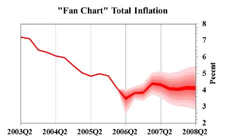
The estimated value and the range of possible future values helps the user see what may happen.
Review
- Spend some quality time labeling your charts with titles, subtitles, and whatever else you can find.
- Our job doesn’t stop with just time series. Users need context to understand what else is going on. That context comes from all over our organization.
- Colocating event data into time series charts helps our user know what might’ve changed. These events are observability data, and arguably have better signal-to-noise ratios.
- The data in our charts can be improved with normal, expected, or objective values to orient the user.
- Coupling alert information can speed incident response.
- Using any sort of projection requires careful visualization.
Summary
Wow, this and the other parts of the series have been a lot of words about slapping charts onto a page! I’ve learned a lot about how to make good dashboards that help my users. Much of this was contrary to my past opinions and advice I’ve given. Beyond my own growth much of this advice shows how much our tools need to improve, especially in the area of context.
This stuff is important. Many organizations rely on these dashboards as the primary source of information for the health, effectiveness, and sheer upness of critical services. They are also a cultural watering hole for engineering organizations. In many cases, they are the business, since you can’t exactly go look at a queue of people using your website. Our only visibility is the data we collect and display.
Dashboards and charts are resources that multiply the creator’s effort. A few days of thoughtful design can repay as thousands of hours of engineers, leadership, and/or users that are well informed. In many cases these can result in improved response time to problems.
That’s worth your time, right?
I hope you’ve enjoyed this guide as much as I’ve enjoyed research and writing it. Please check out the sources cited below each part for more in depth reading on this subject.
This post is part of A Practitioner's Guide to System Dashboard Design.
Citations
Subscribe via RSS!