Presentation and Accessibility in System Dashboard Design
After part 1 we’ve got a nice grid and proper visual weighting within that grid. We’re now on to thinking about the presentation of the data to our user. This is where things often go awry, as many a pixel has been lit in pursuit of catchy graphics. Keep your design decluttered and consistent.
Our guiding principle must be the user’s goals and the integrity of the data we’re displaying. Since this will vary widely — counts of users, fleeting time spent in garbage collection, and mercurial error counts — we must build up a framework we can use to make choices.
To that end, let’s explore what it takes to make a good visualization of system metrics.
Thanks to Lita Cho, Shawn Moore, Rajesh Raman, and Joe Ross for reviewing this post.
This post is part of A Practitioner's Guide to System Dashboard Design.
Choice of Data, Gardening
You might expect this piece to tell you what specific data to put in your dashboard. Well, fair reader, that’s mostly up to you! Remember our users and their goals from part 1. Use your list and decide what best fits the bill for what Few describes as the four stages of monitoring information (32)1:
- Updating high-level situational awareness.
- Identifying and focusing on particular items that need attention.
- Update awareness of this item in greater detail
- Determine whether action is required
- If action is required, accessing additional information to determine appropriate information.
- Response.
In general the RED method and/or the USE method provide with the best signals for high level service function and awareness. Optimally, you should only use key performance indicators (KPIs) as a dashboard is for situational awareness and not for data discovery (Few 30-31)1. That said, there are plenty of use cases where more specific information is needed outside of common KPIs. Refer back to your goals for help when you aren’t sure. Does the user need this to fulfill his/her goals?
We should also remember that these dashboards are often tracking systems that change frequently. You’ll need to add occasional one-off charts or temporary widgets to track new and interesting KPIs or just data that is important for current issues. Your organization should build in time to regularly look at dashboards with a critical eye and sweep away any artifacts that are no longer useful. Check that one chart you added back when you were leaking file descriptors and ask if it’s really needed anymore. You know which one I’m talking about.
Effectiveness Of Visualization
When you open the palette of widgets for your dashboard, there are probably lots of options. Temptation is high to use the fancy ones! But not all of these are equal, as humans do not perceive all forms of visual information the same. Our user is trying to quickly orient themselves, so our job is to present things in the most efficient way.
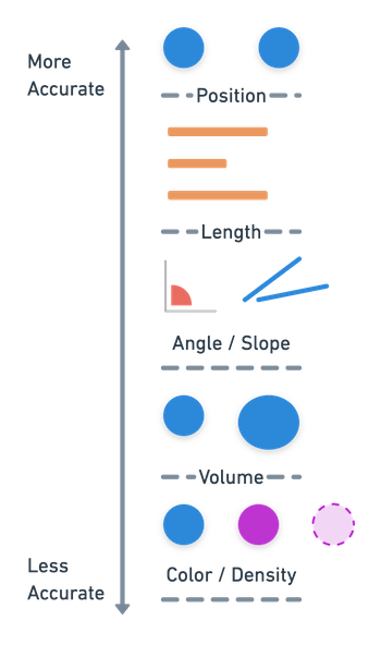
Ranking of perceptual tasks in order of accuracy.
These human quantitative perceptual task rankings (Mackinlay, 125)2 provide a handy guide for determining how easily our reader may be able to process our visualization. Some visual components are actually processed subconsciously using pre-attentive processing. The careful use of color, form, position and motion can greatly ease and speed up important information in a dashboard (Few, 80)1.
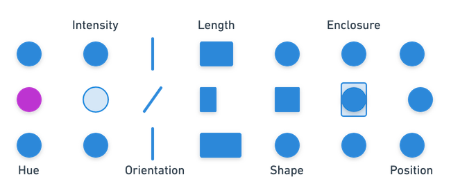
Examples of pre-attentive attributes You can see these without even thinking about it!
Scale and Units
Moving a bit deeper into the form, Cleveland and McGill (830)3 ranked tasks by accuracy for us humans, finding position along a common scale more accurate than on non-aligned scales. Few (40-41) reinforces this by specifically advising the use of units and appropriate detail for data to avoid unnecessary computations for the user. For this reason it is best to use common scales, axis and units where possible.
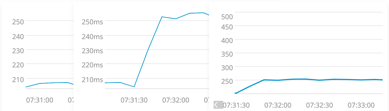
Three charts of the same data, without units, with units and no longer aligned. 250 what?! The left and middle chart are easy to compare, the middle is easier to understand. Alignment and units matter!
With this information you should be able to more effectively choose visualizations, picking those that help your reader quickly perceive the data.
Time
We’re using run charts heavily, so we should take care with how we present time. Charts should use a common time window. If the first chart shows a slice of 1 hour anchored by “now” then so should they all. This is especially true when there is a time selector or other “global” control involved.
Many dashboard tools provide a helpful “cursor” when you are hovering your mouse over a chart, pointing to that same instant in other charts nearby. This can both orient the user’s understanding of time as well as make clear any deviations in the relationship between time and space, as evidenced in this example where one chart is wider than others:
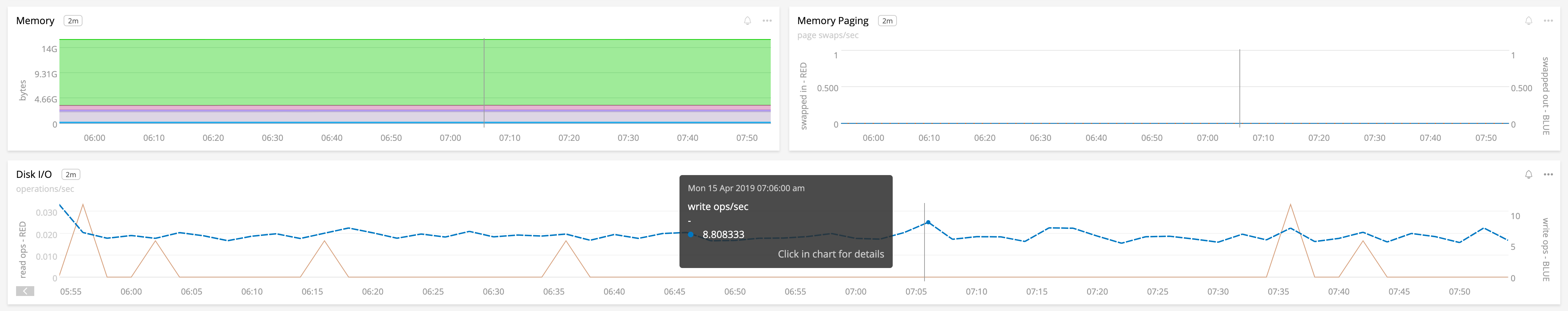
The bottom chart is wider than the top two, but the vertical bar “cursor” keeps us aligned.
Recall our earlier points about alignment, as it also applies horizontally. Widgets or charts that do not adhere to the same time/space relationships should clearly communicate their temporal choices either through visual differences (i.e. a “single value” widget) or clear labeling.
Sneaky Aggregation
Be aware that many visualizations will need to deal with aggregation that happens automatically.
For systems work our dashboards must deal with wildly varying time windows as our users scoot around. The default for most system dashboards is a “current” view showing something ranging from the last hour to the last fifteen minutes. Assuming ten second intervals, every hour will contain 360 data points! Because there are only so many usable pixels for each of our precious little charts, dashboarding tools must make decisions about how to fit all those data points in a small box.
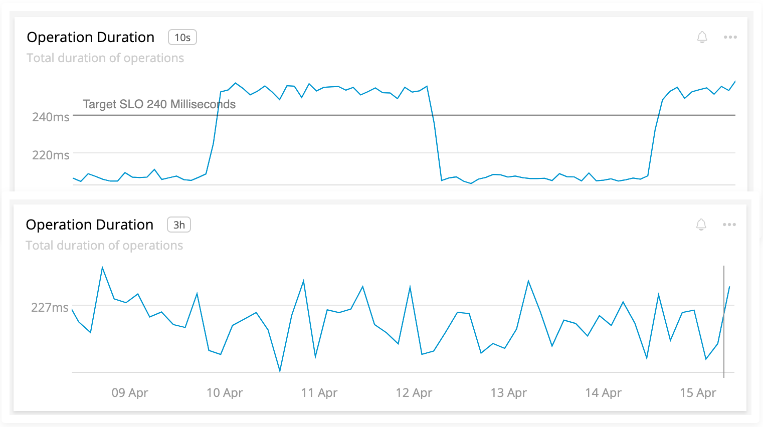
The top chart covers 15 minutes, the bottom 1 week. Note how we completely lose the periodic increase in latency due to the default average aggregation. The resolution is shown to the right of the chart title.
This is usually done via aggregation: showing an average, sum, or something similar. These defaults can make a big difference. Consider our earlier chart, but with the aggregation set to use a maximum instead of an average:
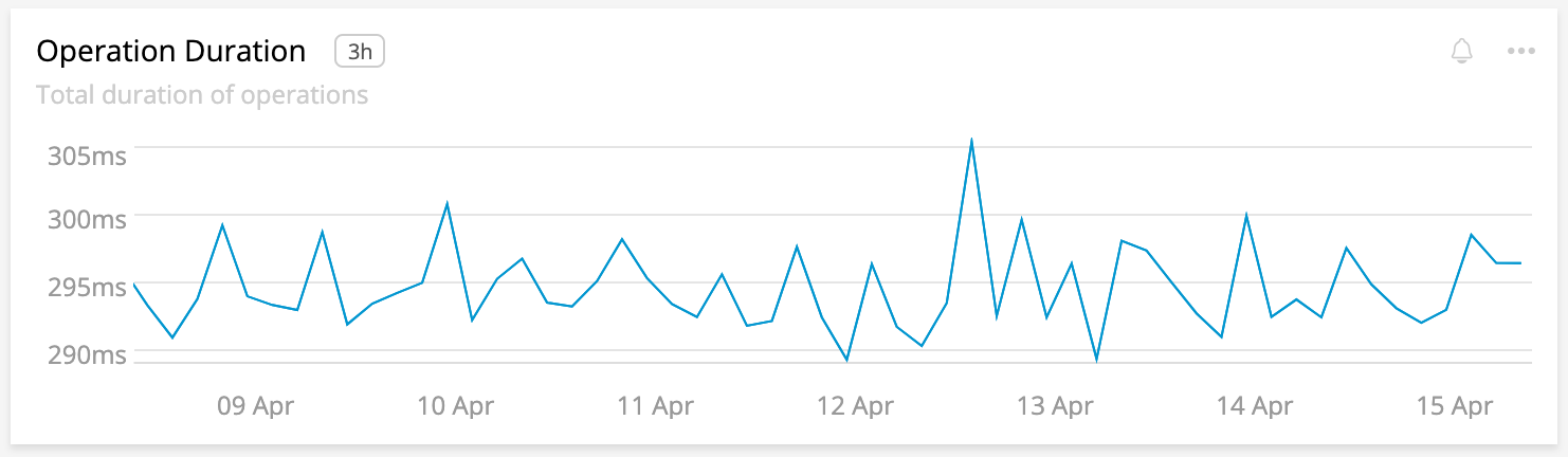
With a maximum aggregation of the weekly data, our latency is ~30% higher.
Consult your tool’s documentation for how this works! We’ll cover concerns about this when we talk about specific chart types.
Aside: Rates and Sums
This is, in my experience, one of the most asked about problems in system dashboards. Showing a counter as either a rate or a sum can have a large effect on the user’s understanding. If you’re viewing the number of errors as a rate then each point on the chart will be the summed count of errors divided by the time elapsed. Viewing as a sum will, of course, be the sum. This means the shape of the data should be the same, only the scale differs.
When using rate or sum it is advised that you make the distinction very clear from the title of the chart. Work with your user to choose the form that best suits their needs when choosing between rate and sum. What do they expect to see?
Note: Be mindful of rate and sum when interacting with aggregation!
Warning: Missing Data
If something goes awry in your measurements you may miss some data points. This can be problematic if your user is assuming regular data points! If this happens, be wary of interpolation. Commonly, system dashboard tools use linear interpolation to connect missing data. Sometimes they are completely unaware the data is missing at all. Sometimes the resolution of the data changes.
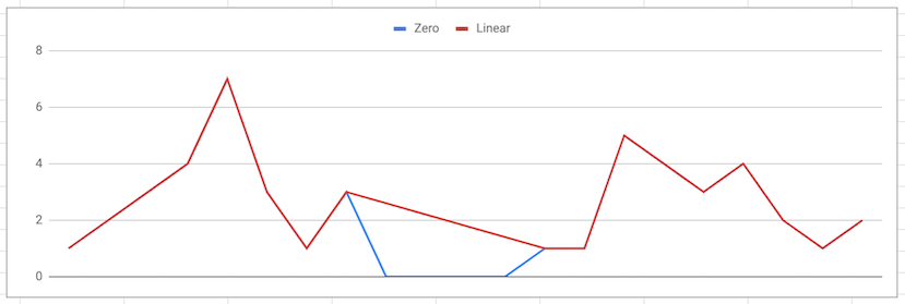
The blue line is filling in zeros for missing data. The red line uses linear interpolation.
In a fit of wonkery, I actually contacted Stephen Few about this problem. I’ve grappled with it for a long time and was curious of his take when trying on missing data in irregular, varying intervals:
If you’re display[ing] values along a timeline, that timeline usually exhibits intervals that are consistent. As such, they are evenly spaced. If the interval changes, the the spacing between intervals should also change accordingly to visually indicate this change and should remain consistent unless the size of the interval changes again, at which time the spacing would change again. Values associated with consecutive intervals of time should be connected with a line, but when intervals are missing values for any reason, the line should not continue through those intervals. If values are collected intermittently (e.g., only when particular events occur), rather than at regular intervals, then they should not be connected with a line. A simple data point (e.g., a dot) or a bar should be used to encode the values in cases like this. Good luck in finding a tool that can handle this.
How interesting! To Stephen’s point I wasn’t sure how to do this in software. To solve that, I sketched it.
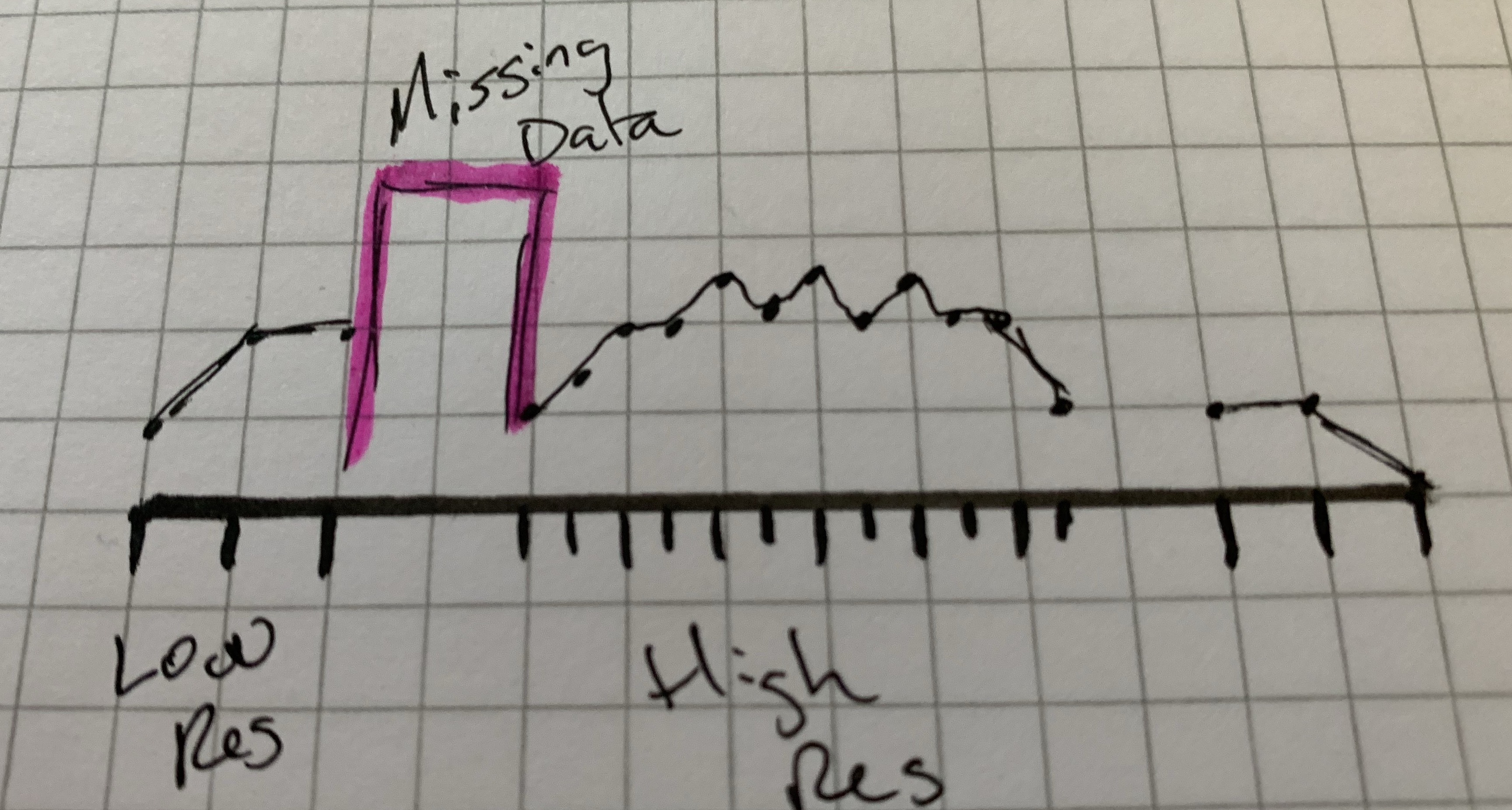
The middle section is faster intervals. We’re missing some data on either side. Missing data does not connect. The pink highlight is informational and would not be in the chart the user sees.
You might wonder why no dashboard packages do this for you? Mostly because they don’t know if data is missing or not. We commonly infer the interval that metrics come in, and in a modern world of ephemeral containers these metrics can come and go in a flash. A tricky problem for sure, and something to aspire to.
General Guidance
Some other great bits:
- Favor soft colors found in nature. Save the use of vivid, attention grabbing colors for thresholds or other health information you want to call attention to. Stephen Few’s Practical Rules for Using Color in Charts is an excellent guide.
- Mute or eliminate background grids, when possible. Consider lightening them. Keep the principle of closure in mind and eliminate some of those boxes.
- Avoid faked perspective, such as in 3D graphics that serve no data purpose.
Accessibility
Your user may have difficulty interpreting your dashboards if they are not accessible. The W3C has lots of content on accessibility to ensure all your users have a great experience. Depending on your tools, some of these may be easier than others, but all are worth considering.
- Color blindness is very common, with 1 in 12 men and 1 in 200 women affected by Red-green color blindness. This is especially worrisome in dashboards as there is often a heavy reliance on using green for “good” and red for “bad” signaling. Leverage multiple techniques for signaling by leveraging the “effectiveness” section above: size, color, text, or icons.
- Still on color, look to the W3C’s guidance for a 4.5:1 contrast ratio between text and backgrounds. You can also use this as a reason to choose clearly distinct colors for data as well. The Consumer Finance Protection Bureau has an excellent guide on color in visualizations.
- Consider screen readers and what they read for your widgets. In addition to descriptive titles, consider additional helper text in the widget. Additionally, consider the export of CSV data with descriptive headers so that users with screen readers have a way to tab through the data.
- Make use of accessible navigation and data enrichment features to leverage browser assistance where applicable with tools like WAI-ARIA.
- What is the target display device? A dashboard for a large TV likely has different needs than one used on a 13” laptop display by an on call engineer. Be sure and use your dashboard during the design phase on an appropriate device.
Summary
There’s a lot to think about when displaying data to our users. There’s a lot to consider and this post provides a good explanation as to the thought that designers and engineers creating our system monitoring tools have to take into consideration. The buck doesn’t stop there though, as you, the designer, must continue to make good choices when building up your dashboards!
Review
- Use KPIs like RED and USE. Your user’s goal will dictate any additional metrics.
- Review dashboards periodically for improvement and cleanup, like the CASE method but for dashboards!
- Preattentive attributes like position, length, slope and color can help with quick comprehension. Some are more accurate than others, choose them wisely!
- Use units everywhere use common scales.
- Time can be tricky, so use consistent time windows. Label any deviations clearly.
- Be aware of forced aggregation and choices on display like rates and sums. Clearly label your charts.
- Consider accessibility in design and data display. Avoid reliance on red and green and ensure sufficient contrast.
Please read on for the next items in my series:
This post is part of A Practitioner's Guide to System Dashboard Design.
Citations
-
Few, Stephen. Information Dashboard Design. Analytics Press, 2013. ↩ ↩2 ↩3
-
Mackinlay, Jock D. Automating the Design of Graphical Presentations of Relational Information. ACM Transactions on Graphics, Vol. 5, 1986 ↩
-
Cleveland, William S., McGill, Robert. Graphical Perception and Graphical Methods for Analyzing Scientific Data. American Association for the Advancement of Science, 1985. ↩
Subscribe via RSS!