Structure and Layout in System Dashboard Design
The modern concept of a digital dashboard was invented by Samuel Daschboerd in 1784 to track the growth of tubercles on mata mata turtles. This was a problem, since modern computers and high resolution displays didn’t exist. Thankfully a few hundred years passed and technology caught up with Samuel’s dreams.
Thanks to Shawn Moore and Joe Ross for reviewing this post.
Ok, not really. As a modern invention, dashboards draw a lot of inspiration from car dashboards. One can also draw some interesting lines from 1960s era NASA mission control rooms and the rise of automation. Any sufficiently complex situation these days, be it a rocket launch or battling aliens in Tony Stark’s helmet, is inevitably represented with some sort of dashboard.
But hey, you didn’t come here for a history lesson. Instead, let’s talk about how to make a good dashboard. Our focus is going to be on making the types of dashboards and run charts used in modern systems monitoring, but many of the lessons will be applicable to other contexts.
There are so many cool doodads, bells, and whistles that it’s hard to know where to start! I’m here to help. We’re going to use the following outline for our tour of dashboard design:
This post is part of A Practitioner's Guide to System Dashboard Design.
Structure And Layout
Stop everything and isolate two questions: who is your target audience and what are their goals?
Knowing the target audience and what they are after is critical to the rest of your work. If your target audience is engineering leadership trying to get a high level view of system function, that’s very different from a single on-call engineer responding to an early morning wake-up page.

Here are some possible users.
Before you start building your dashboard, grab a piece of paper and write out questions that your target user will ask, sort them in priority order, and determine the best data to show in service of that question.
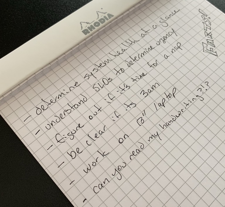
Notes I took when interviewing myself for this post.
Consider The Form
Each element you add to the dashboard needs to be in clear service of the target audience’s goal and the importance of that widget dictates its position. This information should fit on a single screen without scrolling. Our human users can only keep three or four pieces of visual information in working memory so we need to keep all relevant information in one place (Few 79). We can use the single eyeball1 full of information as an aid for our user, avoiding the need to commit any visualizations to memory.
If you need additional visualizations, consider separate dashboards targeted to the goal the user has, such as investigation of a garbage collection issue or downstream dependency failure. Optimally these sorts of investigations can be reused across systems.
You’ll likely want to use a grid design. Humans are especially good at navigating little boxes as described in principles of grouping. This is convenient since pretty much all modern dashboard systems work this way.
With this prioritized list and a grid armature we can now start to add elements to our dashboard. It’s likely you already have an intuition for positioning, placing the most important element at the top left and working left to right, top to bottom.
You likely didn’t need an illustration of this.
This is a common pattern for readers of occidental languages, whose eyes tend to go top left first (Few 107-108)2. It’s important to remember your target audience, however, as some languages work right-to-left or top-to-bottom.3
Don’t Make It Just Yet!
I know you’re eager, but sketch out your work before you start slinging bits:
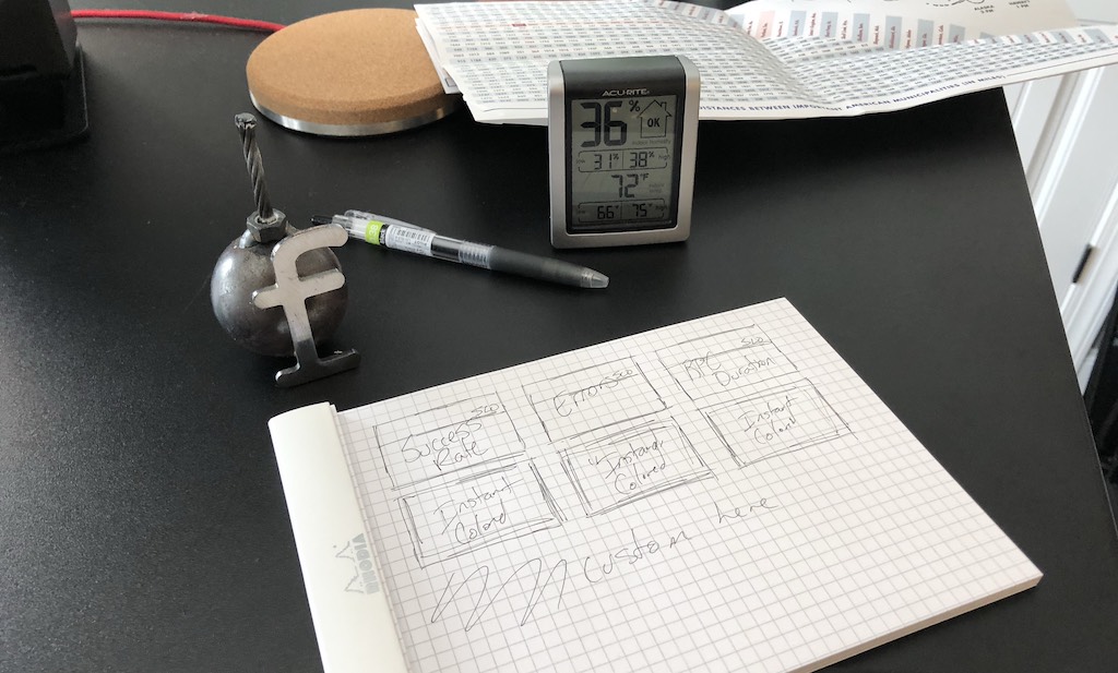
This is a sketch. It was 72ºF at the time with 36% humidity. Always be fbombing observing.
Look at it. Talk to your user about it. Put it on the fridge and consider it as you make a smoothie. Share it with the team. Travel with it and show us tweets of it in interesting places. Ok, that’s a bit much. Regardless, it’s helpful to sketch and play with ideas. For example, I decided post sketch that this should be reordered before I proceeded. My user (me) valued duration higher than errors!
OK, Go Make It!
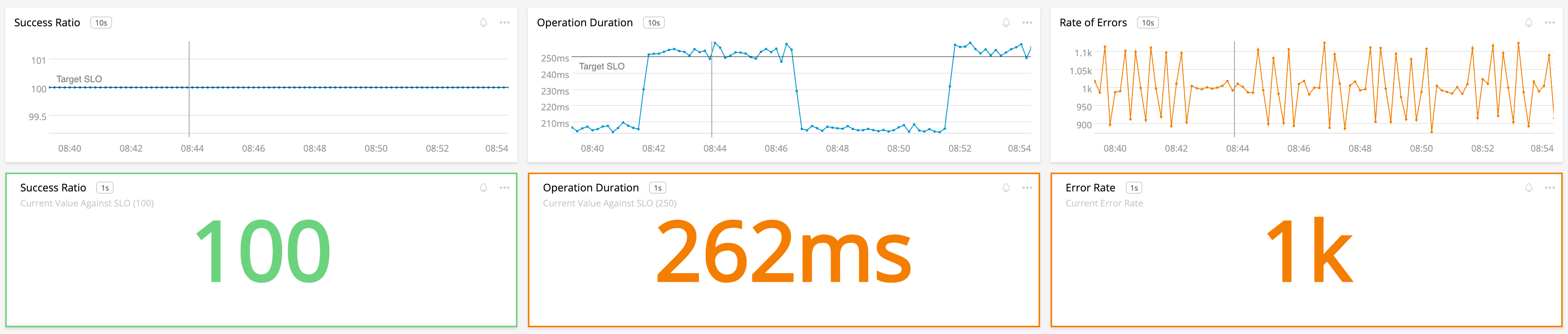
With our grid in hand, it’s common to plop in charts and other widgets of equal size into our grid, wrapping to a new row when we run out of space. Rather than stick with equal sizes, you might consider adjusting the widths of some of the elements for emphasis or clarity. Wider charts not only stand out from an area perspective, they also gain some favorable attributes. Tufte points out a wider chart is more like a horizon and “the human eye is naturally practiced in detecting deviations from the horizon” (186)4. Furthermore, wider charts require less line-wrapping in text and emphasize the causal nature of many charts. This is especially true for run charts which dominate many dashboards. The effect we’re measuring — like memory usage or latency — is the Y axis and time is the X axis. The space allowed for a wider chart helps to “elaborate on the causal variable in more detail” (187)4. I sense foreshadowing for future pieces here!
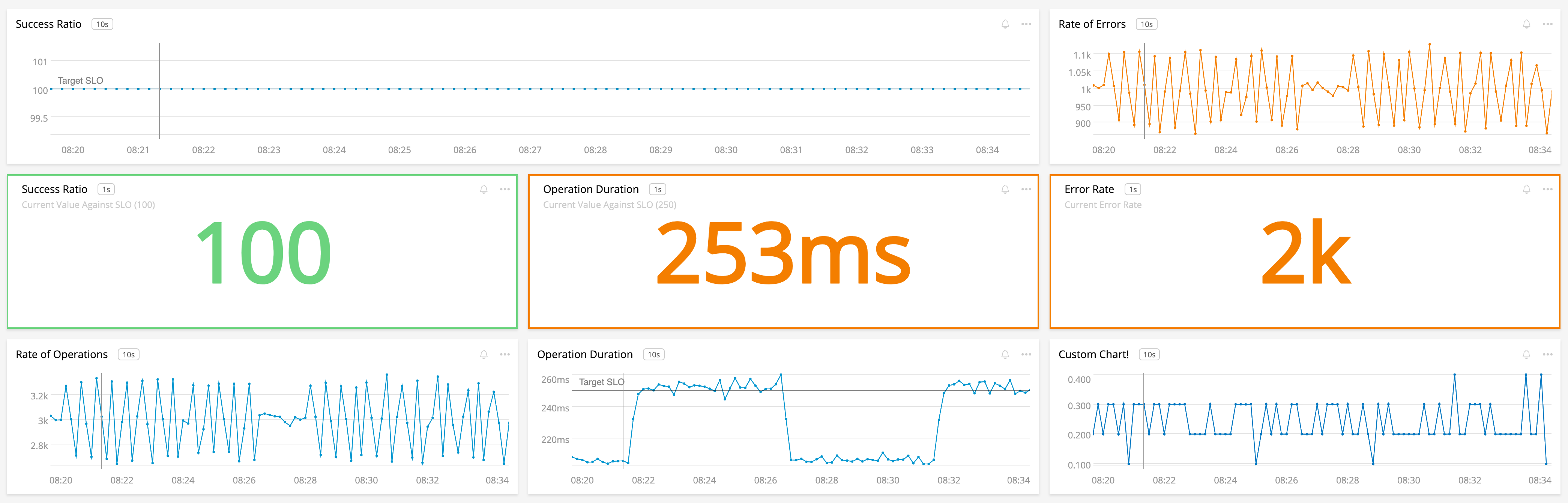
We’ve got a wide chart here, showing how important Success Ratio is for us!
Note that even the “normal” charts in that dashboard are still wider than they are tall. This is good for the reasons above as well as pleasing for humans, shout out to the golden ratio.
Summary
Congrats! You’ve got the start of a dashboard that’s based on wise guidance by some of the greatest minds in dashboarding5. This should serve as an excellent foundation as you grow your dashboard.
A nice start. Pat yourself on the back and have a snack.
Review
Let’s review the things we picked up here:
- I was lazy and made up something about turtles for dashboard origins
- Be deliberate, know your user and the questions they are asking
- Keep it simple, don’t force users to scroll and remember
- Make more linked dashboards if needed
- Put important information in important places
- Use a grid and favor charts that are a bit wider than tall
Please read on for the next items in my series:
This post is part of A Practitioner's Guide to System Dashboard Design.
Citations & Notes
-
Some entities have more than one eye. ↩
-
Few, Stephen. Information Dashboard Design. Analytics Press, 2013. ↩
-
If your dashboard targets aliens or robots, you’ll need to consult the manual for appropriate designs. ↩
-
Tufte, Edward R. The Visual Display of Quantitative Information. Graphics Press, 1998. ↩ ↩2
-
And some research by me. :P ↩
Subscribe via RSS!