What Charts To Use in System Dashboard Design
With Part 1: Structure and Layout and Part 2: Presentation and Accessibility you’re probably itching to have some damned dashboards made. Enough theory, which chart should you use?
Thanks to Lita Cho, Shawn Moore, Rajesh Raman, and Joe Ross for reviewing this post.
This post is part of A Practitioner's Guide to System Dashboard Design.
Tables
Wait, a table isn’t a visualization is it? Heck yes it is! Few1 reminds us that if you’re showing single values, there’s no reason to have any sort of chart (114)1. For just a few values, using a table is quite effective.
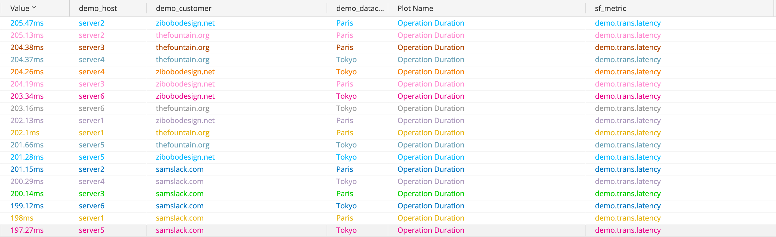
The trusty table.
Tables are common and well-understood visualizations that excel2 when looking up a value. The above table makes finding a value and the dimensions related to it very easy. This version may be too dense for a system dashboard, but we can adapt it into a “single value” like so:
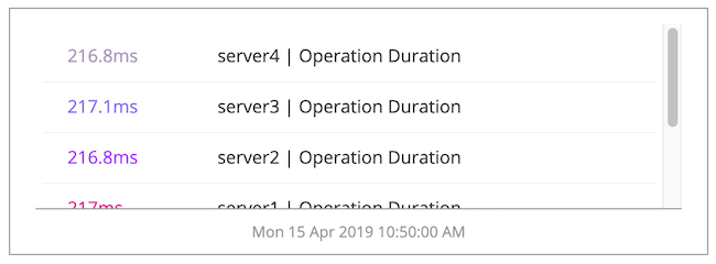
A table compressed to something widget-worthy.
If the user needs to know a single value such as the sum, average, or “instant” then using simple numbers or tables is an excellent fit.
Line Charts
Line charts are well suited to most data you’ll be displaying. The line chart begins with points, then connects the points with a line. This is worth saying out loud here because on a run chart this interpolation of data gives the user a sense of shape over time. You’ll commonly hear people say that a metric is trending up or down as they watch updates.
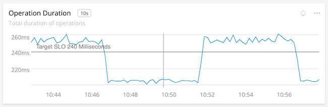
The shape is clear. Something is happening to our latency!
Line charts are popular visualizations because they embody many pre-attentive attributes with a minimum amount of pixels. Lines give us slope and angle, position, and color to derive lots of information without thinking hard. We can even get fancy and use line width and intensity to draw attention:
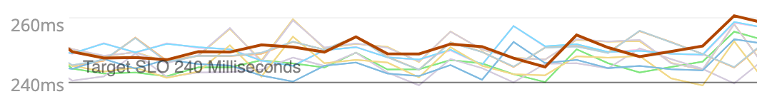
The brown line is clearly the important one here.
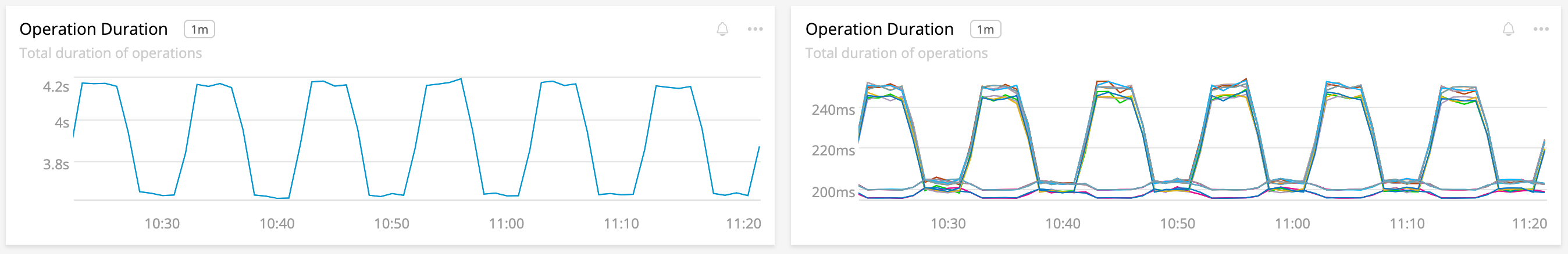
Not All Line Charts
Before you close this tab and make everything a line chart, there are a few things to be aware of. Having too many lines in a chart can hide shape, muddy color, add perception latency and generally make them useless, aside from spotting outliers. Skip ahead to heat maps for some help there.
The lines are so close as to be hard to differentiate.
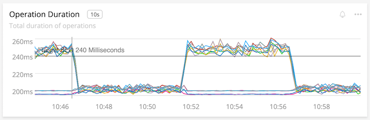
Line charts interpolate data between two points with a line. This is desirable in most cases, since the shape provided aids perception. Unfortunately interpolation can also hide missing information or the opposite; make us think we have data we really don’t. Take our example line chart from earlier, now with points at each reading:
The points show that we only get one reading at each change in latency.
The distance of the line might imply there are more measurements than really exist, such as the big changes in the above chart.
Area Charts
First, don’t use area charts that aren’t stacked. Occlusion just hides data, which is confusing.
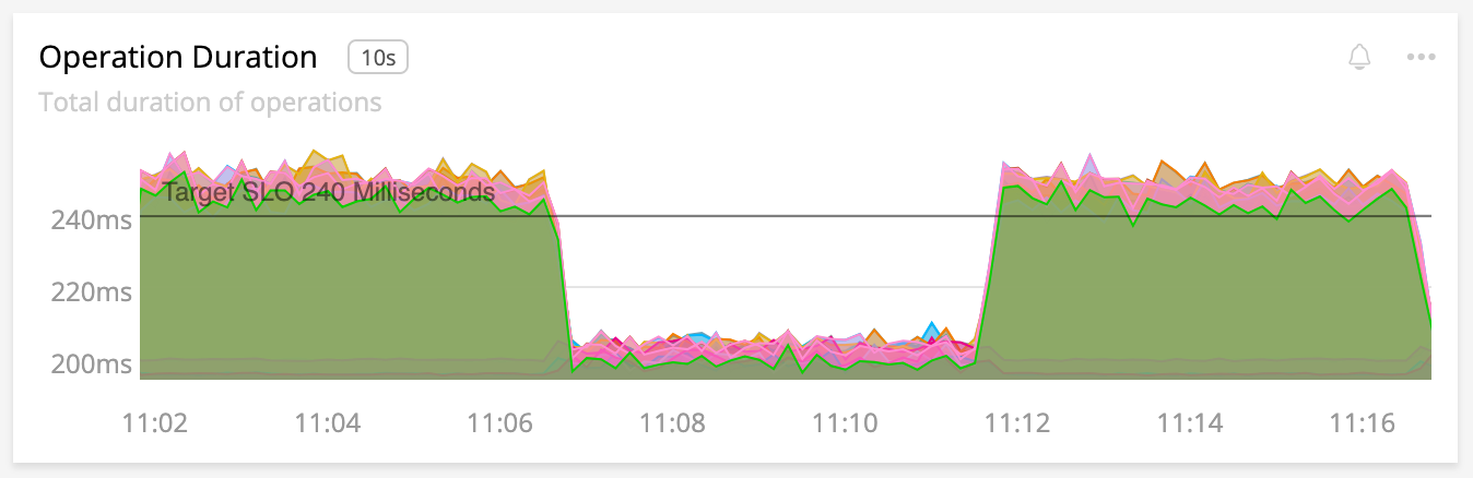
What even is this? I can’t see anything but green.
Area charts are best used when the whole of sums is the important value, as in showing the contribution a few steps make to a total duration. They share a lot with line charts, in that they show shape. Unfortunately this shape is also their downfall: when one of the bottom areas changes, so do all the areas above it. A user may be confused where to attribute the change. Spotting the real change in this situation can be tricky.
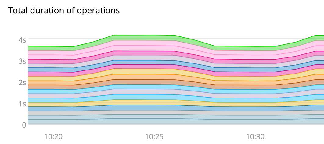
Our latency moves around 4s, but we can’t tell what is contributing to the change. Is it all of the lines?
Few suggests that instead of using an area chart, use a single line chart showing the sum and an additional chart showing the contributions (Few, 146)1. This makes spotting the change significantly easier.
This is the same data as the area chart above. The left chart shows sum of latency, right chart shows each contributor. The contributors to latency are obvious and we can see our total!
Bar Charts
Where line charts show shapes, bar charts show “exact” values. For most system metrics you’re better off using a line chart. The exception would be a chart which compares a few metrics:
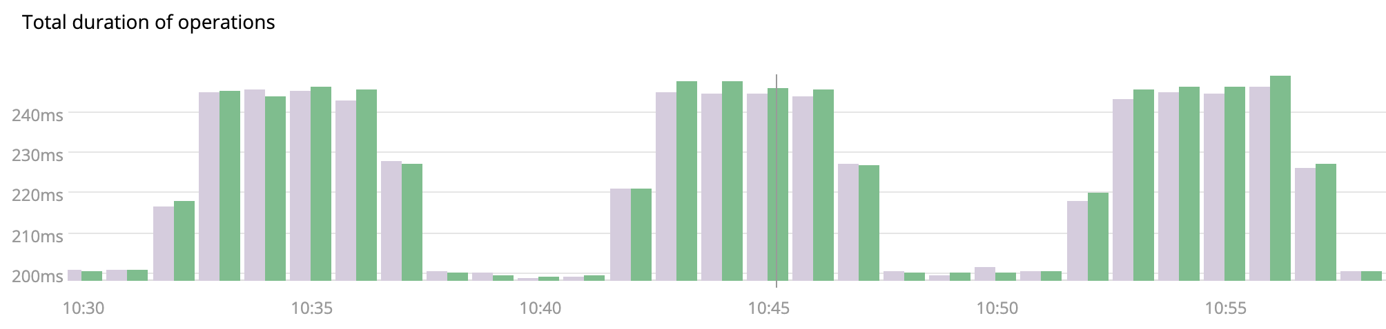
We can easily compare these two time series using bars. More would be tough.
The bar chart aids comparison of values at each interval through clear interval association and easy comparison of length by the user. Choosing a bar chart therefore means that your user’s goal is the comparison of a few values over other concerns.
Be careful to avoid moiré patterns. This can happen when your bars are too small and evenly spaced. Do include a little space between bars to aid the visual separation, as seen above.
Stacked Bars
See stacked area charts. You rarely want to use a stacked chart, unless the focus is on the whole value. Users will have difficulty comparing sizes in the stack.
Heat Maps
Reach for heat maps when you have a line chart that has too many lines to make sense of. Heat maps vary the intensity of color so that a lot of data can be packed in to a small space. Where occlusion hurts line charts, heat maps use the overlap to add more color. This has the novel side effect of showing banding where there is overlap aiding in pattern and outlier detection.
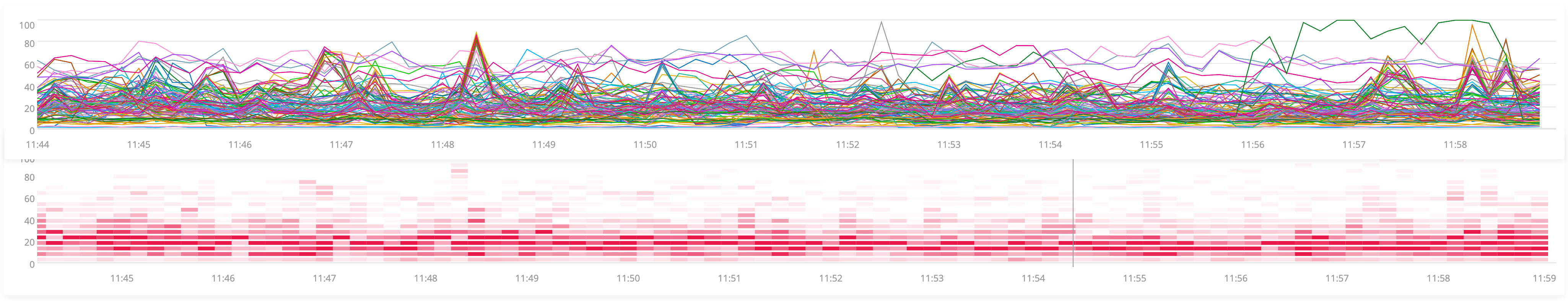
The line chart is terrible at everything but outliers. The heat map shows where the population is grouped.
This ability to view more data and spot patterns isn’t free. It comes with a decrease in accuracy because humans can’t easily differentiate more than a few intensities of a color. Few says that more than 5 intensities is the limit for distinctiveness (Few, 86)1. This means that heat maps are best deployed in situations where accuracy is less important than the general shape of the visualization.
Gauges, Bullet, Ranges, etc
Only use a visualization with limits if the data actually has those limits. For example, displaying requests per second as a gauge is misleading, as it has no maximum!
If you do have a limit to show, such as a percentage or a queue with a maximum depth, then using these sorts of visualizations can be incredibly helpful. It allows you to communicate what the limit is as well as how close a value is to that limit. Use these types of visualizations when your metric has a basis for comparison, such as SLOs!
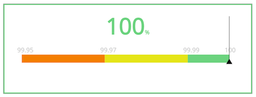
This is a suitable use of a range as it has bounds and orients the user.
Combining this with color yields a quick understanding of current value, upper and lower bounds and urgency of the current value.
Sadly, I am not aware of any tools that allow the use of bullet graphs in their fullest form. At best, you can usually find only a single bullet.
Others
Some that don’t deserve a whole section.
- Pie charts: Don’t. Humans generally can’t understand the area of a pie slice. Use bars.
- Donut charts: Mostly cute ways of showing a single value. Or a pie chart with a hole in it.
- Stacked Line Charts: Area charts, but worse since the lack of area fill makes it a surprise. Avoid.
- Flame graphs: Great for some uses cases, not really in scope for system dashboards, more for profilers.
- Sparklines: Great to supplement single values, but often lack context without the familiar bits of a line chart. Few proposes what he calls sparkstrips that add bands of colored or hue to orient the reader. Sadly I don’t know of any tools that support these improvements.
- Box plots: Not common in our tools
- Dot plots: Use bars. May have some use cases for rare data over a long period?
- Scatter plots: Rad for correlation, but that’s a specialized case that we’re not covering here.
- Dials and gauges: If your data does not actually have lower and upper-bounds, presenting it in a dial is misleading. They also waste a lot of space.
Summary
Before you flame me for missing some weird visualization or an option that your tool has, let me remind you that if your user understands the dashboard, chart or visualization then it’s good. As your use case broadens then so will your user base and we fall back on the guidance from Part 2 to choose our visualizations.
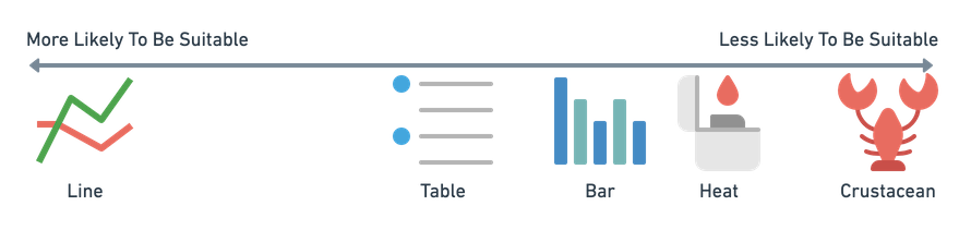
Line is probably what you want. Maybe others. A lobster is not a chart.
Use line charts, they are great! Single value or tabular charts are excellent for instant/single values. Bars make for great comparisons of small numbers of series and heat maps have some utility.
Please read on for the next items in my series:
This post is part of A Practitioner's Guide to System Dashboard Design.
Citations
Subscribe via RSS!